Assignment 5: Redesigning Instructional Materials Using Multimedia Principles.
Inquiry-based learning and research are important skills to learn in elementary school and are a focus in my school this year. In looking for materials to use for a 5th grade introduction to the Big6 research method, I was immediately drawn to the somewhat old-school but information laden site, Big6.com. Mike Eisenberg, author of the research strategy known as the Big6 created for students as young as elementary school age, uses exclamation marks when he encourages educators to peruse presentations teachers have created to teach this method of inquiry. However, imagine my disappointment when I found that many were based on slides such as these:
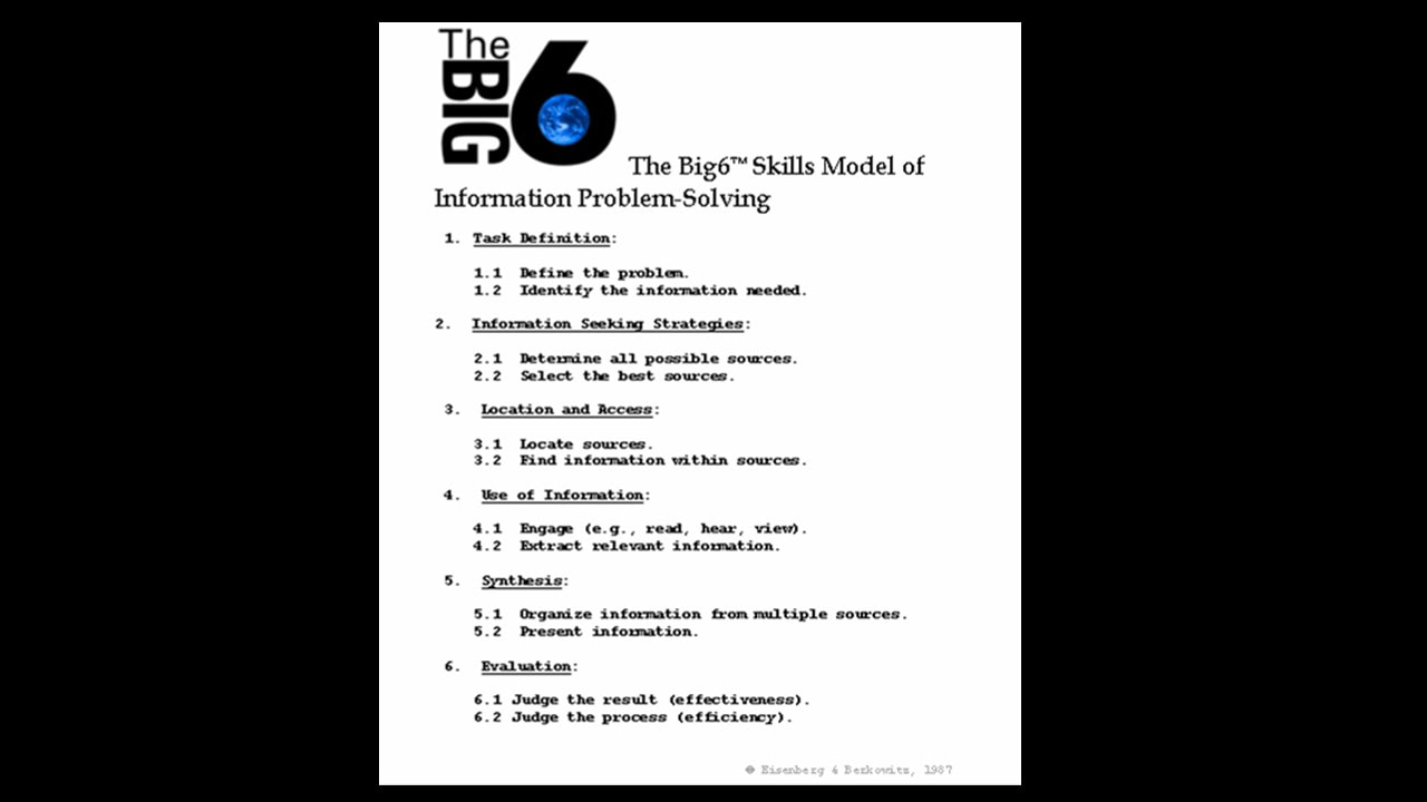
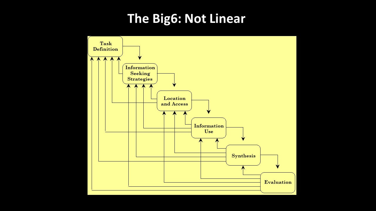
If I am to use these in instruction or offer such a lesson in collaboration with a content-area teacher, a redesign is in order. While I understand the principle of offering the big picture outline of the 6 steps in the Big6, presenting an antiquated, low resolution, typed outline in a presentation is never appropriate. And in the second slide, while the author’s intent to disprove the idea that the steps in the Big6 method are linear is admirable, the end result does not leave a clear idea of how the Big6 works in a learner’s mind, particularly an upper elementary student.
The dual coding theory describes the increased effectiveness of our brains to process information when given the same information via two different forms of media (text, audio, images). According to J.L (2015), dual coding (that is, the brain has 2 separate channels: audio and visual, for processing information) is a tenet of Mayer’s multimedia principle. Incorporating aural and visual media in lessons is critical to learning.
I considered how to best handle the volume of information covered in the two less-than-acceptable slides above in a new Powerpoint presentation that carefully incorporates the elements of design as well as multimedia principles to best engage the dual coding theory. As suggested by Hagen and Golombisky (2013), visual unity is accomplished through the design elements of color, shape, line and space as well as repetition and consistency throughout the presentation.
My first step was the break the information down into bite-sized pieces as well as simply cut back dramatically on the amount of text on each slide. The theory behind this method of presenting information lies in Clark and Mayer’s (2011) principle of multimedia design known as the Segmenting Principle. They say that complex material should be broken down into logical sections. The teacher showing my new slides will use the visuals as a prompt while she talks about each concept, creating an environment for better transfer for students.
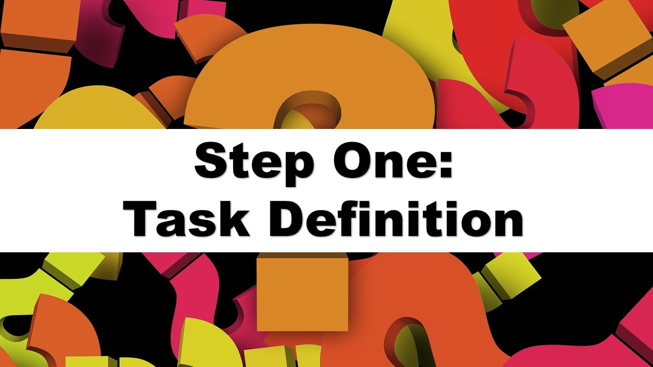
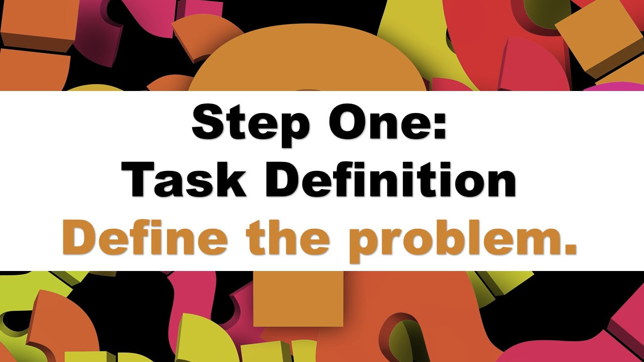
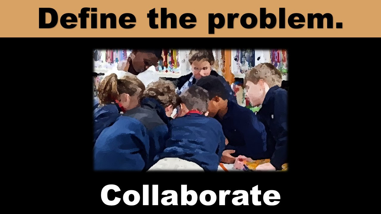
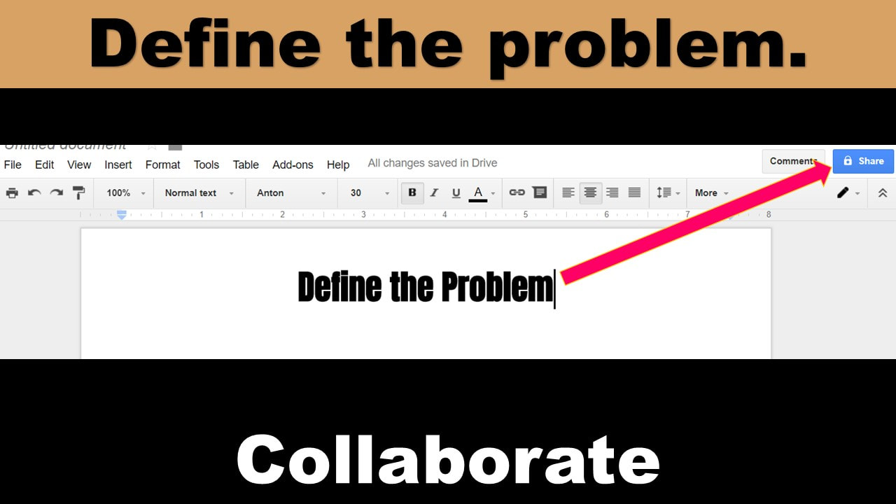
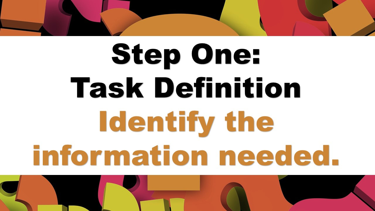
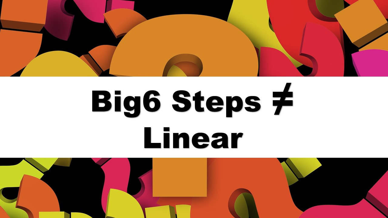
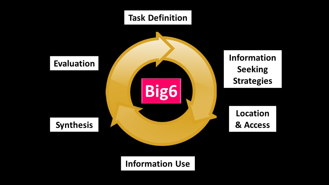
Next, I chose an image from Pixabay.com where all images are licensed for reuse with no attribution for the introductory slide with is just a bold question mark. This image set my color scheme and my black backgrounds. The thick white line draws the viewer’s attention to the necessary text on the subsequent slides while the bold question marks in the background are a constant reminder that we use the Big6 when we’re trying to answer a question. Once it becomes necessary to start explaining the individual steps, a new slide style is introduced, maintaining the black background and a color from one of the question marks but introducing an image that parallels the content. The final two slides address the graphic showing that the Big6 steps are not a linear process. The use of circular arrows simplifiees the image making the concept clearer to students.
Click on the first image below and then click through the arrows to see the redesigned slides.
Resources used:
Big 6. (2017). Information and technology skills for student success. Retrieved from
http://big6.com/pages/lessons/presentations.php
Kiddle.co. (2017). Safe visual search engine for kids. Retrieved from http://kiddle.co
Scholastic. (2017). Welcome to Grolier Online. Retrieved from http://auth.grolier.com/login/go_login_page.html?bffs=N
The dual coding theory describes the increased effectiveness of our brains to process information when given the same information via two different forms of media (text, audio, images). According to J.L (2015), dual coding (that is, the brain has 2 separate channels: audio and visual, for processing information) is a tenet of Mayer’s multimedia principle. Incorporating aural and visual media in lessons is critical to learning.
I considered how to best handle the volume of information covered in the two less-than-acceptable slides above in a new Powerpoint presentation that carefully incorporates the elements of design as well as multimedia principles to best engage the dual coding theory. As suggested by Hagen and Golombisky (2013), visual unity is accomplished through the design elements of color, shape, line and space as well as repetition and consistency throughout the presentation.
My first step was the break the information down into bite-sized pieces as well as simply cut back dramatically on the amount of text on each slide. The theory behind this method of presenting information lies in Clark and Mayer’s (2011) principle of multimedia design known as the Segmenting Principle. They say that complex material should be broken down into logical sections. The teacher showing my new slides will use the visuals as a prompt while she talks about each concept, creating an environment for better transfer for students.
Next, I chose an image from Pixabay.com where all images are licensed for reuse with no attribution for the introductory slide with is just a bold question mark. This image set my color scheme and my black backgrounds. The thick white line draws the viewer’s attention to the necessary text on the subsequent slides while the bold question marks in the background are a constant reminder that we use the Big6 when we’re trying to answer a question. Once it becomes necessary to start explaining the individual steps, a new slide style is introduced, maintaining the black background and a color from one of the question marks but introducing an image that parallels the content. The final two slides address the graphic showing that the Big6 steps are not a linear process. The use of circular arrows simplifiees the image making the concept clearer to students.
Click on the first image below and then click through the arrows to see the redesigned slides.
Resources used:
Big 6. (2017). Information and technology skills for student success. Retrieved from
http://big6.com/pages/lessons/presentations.php
Kiddle.co. (2017). Safe visual search engine for kids. Retrieved from http://kiddle.co
Scholastic. (2017). Welcome to Grolier Online. Retrieved from http://auth.grolier.com/login/go_login_page.html?bffs=N